Search Input (System 1)
How the SDK takes over the website's existing search bar and button.
This page explains how the SDK takes over the website’s existing search bar and button.
What Is Search Input?
Section titled “What Is Search Input?”Search Input is the first system that runs when the SDK loads. Its job is simple: take control of the website’s search bar.
Every website already has a search bar somewhere, usually in the header. The SDK finds that search bar and either replaces it or clones it. From that point on, everything the visitor types goes through Segmentify instead of the website’s original search.
Two Ways to Take Over the Search Bar
Section titled “Two Ways to Take Over the Search Bar”There are two approaches for how the SDK handles the existing search bar:
Replace
Section titled “Replace”The SDK removes the website’s original search bar and puts its own in the same spot.
- The original search bar disappears.
- A brand-new Segmentify search bar appears in its place.
- You have full control over what the new search bar looks like.
The SDK hides the website’s original search bar and creates a copy of it.
- The original search bar becomes invisible (but still exists in the background).
- The SDK creates a new search bar that looks and behaves the way you configure it.
- This approach is useful when the original search bar has complex styling that you want to preserve.
What Happens When the Visitor Interacts
Section titled “What Happens When the Visitor Interacts”When the visitor clicks on the search bar or starts typing, one of two things can happen. You decide which one:
Option A: Open the Searchbox (popup)
Section titled “Option A: Open the Searchbox (popup)”The visitor clicks the search bar, and a popup appears with suggestions, recent searches, and instant results. This is the most common setup.
Option B: Go to the Results Page
Section titled “Option B: Go to the Results Page”The visitor types a query and presses Enter. They are taken directly to the search results page. No popup appears.
You can also combine both: the popup opens while typing, and pressing Enter takes the visitor to the full results page.
We already mentioned this in the Introduction page.
What the New Search Bar Can Include
Section titled “What the New Search Bar Can Include”When the SDK replaces or clones the search bar, you decide what the new search bar area looks like. It can include:
- A text input field where the visitor types their search query.
- A search button a clickable button that submits the search (e.g., a magnifying glass icon or a “Search” button).
- A voice search button lets the visitor speak their search query instead of typing it.
You can arrange these in any order and control their sizes. For example you can just have the search icon and disable the input completely. And you can transfer typing to the searchbox by clicking the search icon. See the example below:
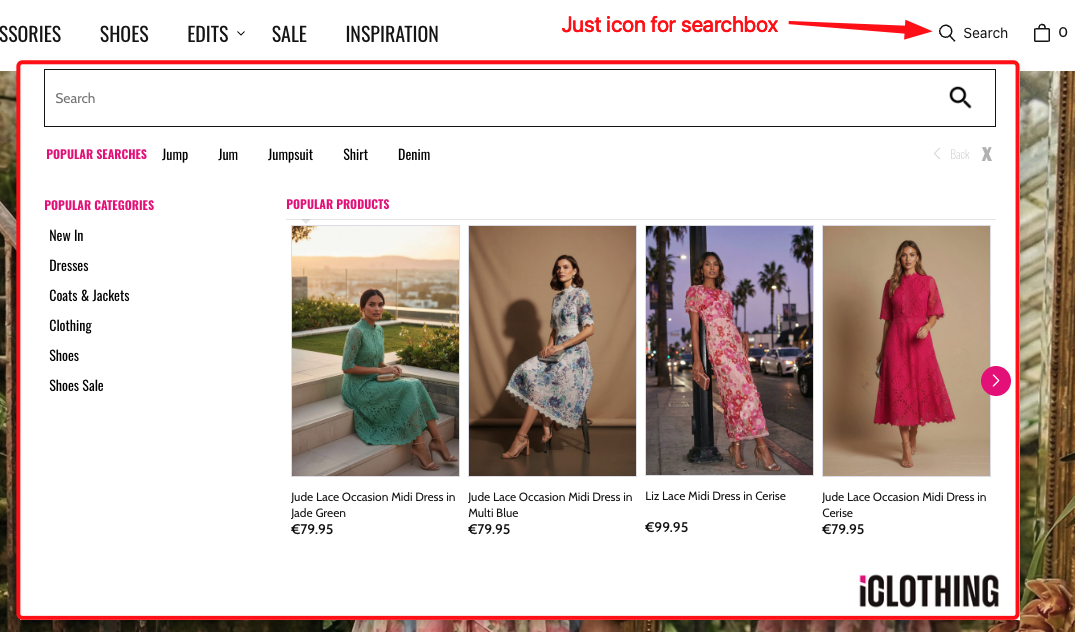
Contact your Segmentify account manager to learn more about what can be configured in the search input.
How the Search Bar Looks
Section titled “How the Search Bar Looks”The search bar has two possible visual styles:
Default Style
Section titled “Default Style”The search bar replaces the original one inline. It appears right where the original was, without any special effects. We already showed A classic example of this in the Introduction page.
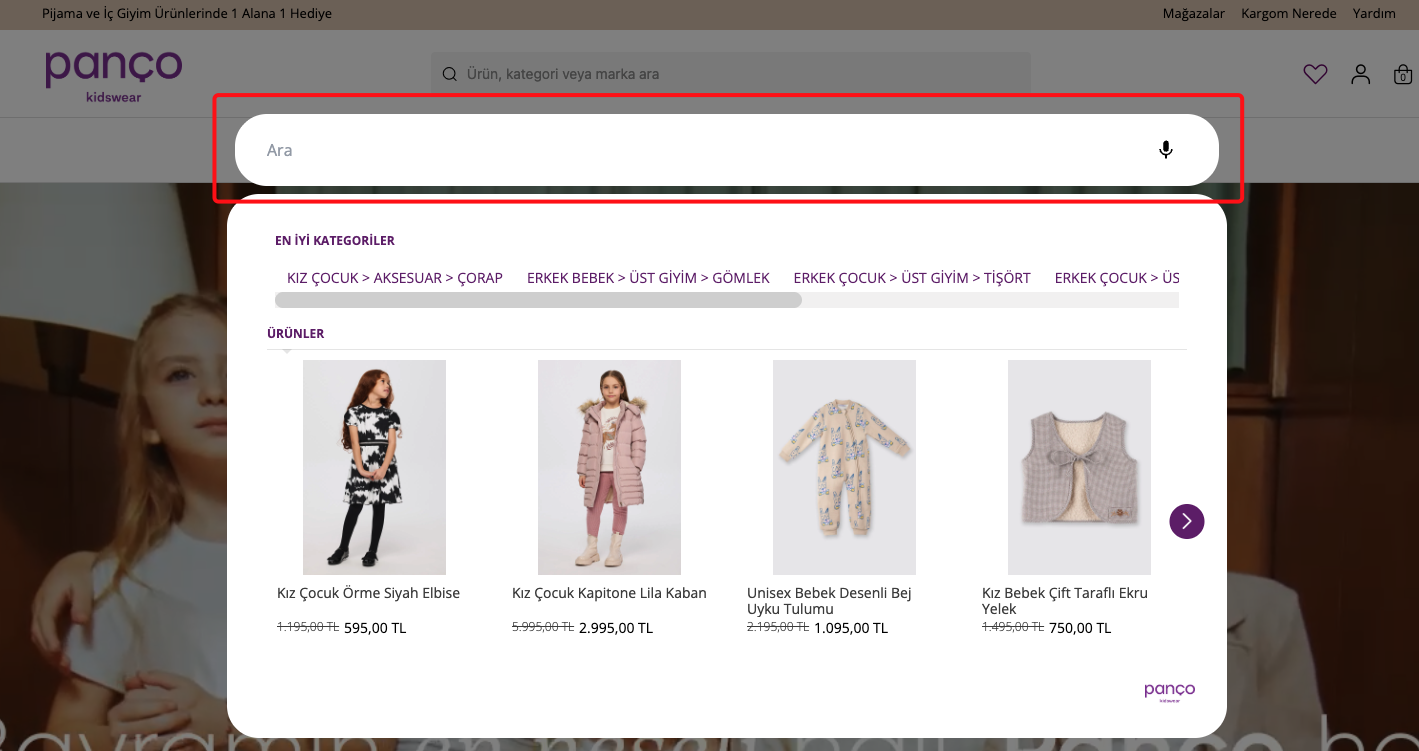
Modal Style
Section titled “Modal Style”When the visitor clicks the search bar, a full-screen overlay opens (mainly used on mobile). The visitor types inside the overlay. This is useful on small screens where a popup would feel too cramped. An example can be seen in below:
Connecting to the Existing Website
Section titled “Connecting to the Existing Website”The SDK needs to know where the original search bar and button are on the website. You tell it by pointing to the existing elements on the page.
You specify:
Which element is the search input?
The text field where visitors type.Which element is the search button?
The button that submits the search.Which area is "safe"?
The area around the search bar (like the header) where clicking should NOT close the popup.Keyword Redirections
Section titled “Keyword Redirections”You can set up keyword redirections so that when a visitor searches for a specific word, they get sent to a specific page instead of seeing search results.
For example:
- Searching
couponcould redirect to/promotions. - Searching
flowercould redirect to/flowers.
You can control:
- Which keywords redirect to which pages.
- Whether the match is case-sensitive (does “Sale” and “sale” both redirect?).
- How special characters are handled in the URL (for example, replacing spaces with
+).
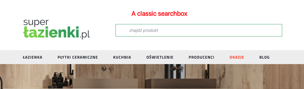
Second Search Bar
Section titled “Second Search Bar”Some websites have two search bars. For example, one in the header and one in a sidebar or mobile menu.
The SDK supports this. You can configure a second, independent search bar that works alongside the first one. Each one can have its own settings and behavior. Two searchbox can exist on the same page at different places. For example one can be in the header and the other one can be seen only when you scroll down the page. Because our customer wanted to show a fixed header than original header of the page.
This is the first checkbox that lives in the original header:
This is the second checkbox that lives in the fixed header:
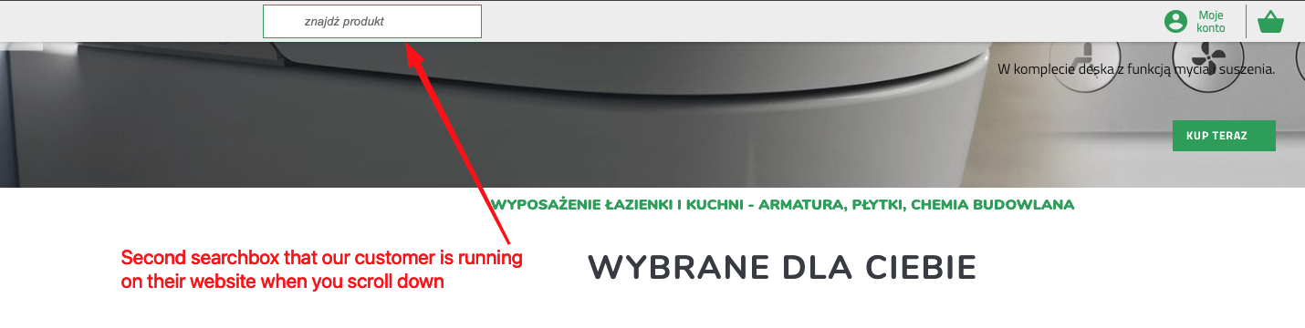
As you can see, the second search bar is completely independent of the first one. It has its own settings and behavior.
Mobile vs Desktop
Section titled “Mobile vs Desktop”The Search Input system has separate settings for mobile and desktop. This means:
- On desktop, you might use the “replace” approach with a default inline style.
- On mobile, you might use the “replace” approach with a modal (full-screen) style.
The SDK automatically picks the right one based on the visitor’s screen size.
Summary
Section titled “Summary”| Capability | What it means |
|---|---|
| Replace or Clone | Choose whether to replace the original search bar entirely or hide it and add a new one. |
| Trigger behavior | Choose whether typing opens a popup (Searchbox) or goes straight to the results page. |
| Visual style | Choose between an inline search bar or a full-screen modal overlay. |
| Voice search | You can add a microphone button so visitors can search by speaking. |
| Keyword redirections | Send specific keywords to specific pages instead of showing search results. |
| Second search bar | Support for websites that have two search bars on the same page. |
| Mobile / Desktop | Different settings for mobile and desktop screens. |
Configuration Reference (for developers)
Section titled “Configuration Reference (for developers)”The Search Input system is configured through the searchInput key in the main config object passed to SegmentifySearch.run(). It has separate mobile and desktop sub-keys, each with the same shape:
SegmentifySearch.run({ searchInput: { mobile: { mode: { /* ... */ }, replaceConfig: { /* ... */ }, }, desktop: { mode: { /* ... */ }, replaceConfig: { /* ... */ }, }, }, // ... other config keys});mode — how the SDK takes over the search bar
Section titled “mode — how the SDK takes over the search bar”mode: { type: 'replace', // Required. 'replace' or 'clone' designType: 'default', // 'default' (inline) or 'modal' (full-screen overlay) triggerModul: 'searchbox', // 'searchbox' (opens popup) or 'searchandising' (goes to results page) target: '#searchQuery', // Required. CSS selector for the element to replace or clone searchInput: '#searchQuery', // CSS selector for the website's existing search input searchButton: '#searchButton', // CSS selector for the website's existing search button safeArea: '#head', // CSS selector where clicking won't close the popup searchUrlPrefix: '/', // URL prefix for the search results page redirectionMap: { // Map keywords to redirect URLs coupon: '/promotions', }, redirectionCaseSensitivity: false, // When true, redirections are case-sensitive redirectionReplaceMap: { // Character replacements in the URL ' ': '+', },}replaceConfig — the layout of the new search bar
Section titled “replaceConfig — the layout of the new search bar”Only used when mode.type is 'replace'. Defines the visual structure of the replacement search bar as a tree of components.
replaceConfig: { designName: 'default', layout: { component: 'main', viewMode: 'horizontal', // 'horizontal' or 'vertical' width: 12, // 1-12 column grid children: [ { component: 'searchInput', designName: 'default', width: 10, componentOptions: { placeholder: 'Search products...', clearIcon: true, }, }, { component: 'searchButton', // trigger: 'redirect' (go to results page) or 'openSearch' (open popup) designName: 'default', width: 2, componentOptions: { trigger: 'redirect', innerText: 'Search', }, }, { component: 'voiceSearch', // Microphone button for voice search }, ], },}Second search bar
Section titled “Second search bar”To support a second search bar on the same page, add secondMode and secondReplaceConfig alongside the primary ones. They have the exact same shape as mode and replaceConfig.
desktop: { mode: { /* primary search bar settings */ }, replaceConfig: { /* primary layout */ }, secondMode: { /* second search bar settings */ }, secondReplaceConfig: { /* second layout */ },}Full example
Section titled “Full example”SegmentifySearch.run({ searchInput: { desktop: { mode: { type: 'replace', designType: 'default', target: '#searchQuery', searchInput: '#searchQuery', searchButton: '#searchButton', safeArea: '#head', searchUrlPrefix: '/', redirectionMap: { coupon: '/promotions' }, redirectionCaseSensitivity: false, redirectionReplaceMap: { ' ': '+' }, }, replaceConfig: { designName: 'default', layout: { component: 'main', viewMode: 'horizontal', width: 12, children: [ { component: 'searchInput', width: 10, componentOptions: { placeholder: 'Search', clearIcon: true }, }, { component: 'searchButton', width: 2, componentOptions: { trigger: 'redirect', innerText: 'Search' }, }, { component: 'voiceSearch' }, ], }, }, }, mobile: { mode: { type: 'replace', designType: 'modal', triggerModul: 'searchbox', target: '#searchQuery', searchInput: '#searchQuery', searchButton: '#searchButton', safeArea: '#head', }, replaceConfig: { designName: 'default', layout: { component: 'main', viewMode: 'horizontal', width: 12, children: [ { component: 'searchInput', width: 12, componentOptions: { placeholder: 'Search', clearIcon: true }, }, ], }, }, }, }, // ...searchBox, searchandising, breakpoint, etc.});