Sorting and Pagination
How visitors reorder search results and navigate through multiple pages of products.
This page explains how visitors reorder search results and navigate through multiple pages of products.
Sorting
Section titled “Sorting”What the Visitor Sees
Section titled “What the Visitor Sees”Sorting lets the visitor change the order of search results. For example, they might want to see the cheapest products first, or the newest arrivals.
The sorting control usually appears at the top of the results page, near the result count.
Available Sort Orders
Section titled “Available Sort Orders”The SDK supports 8 built-in sort orders:
| Sort Order | What it means |
|---|---|
| Smart Sorting | Segmentify’s AI picks the best order based on relevance, popularity, and personalization. |
| Best Match | Products are ordered by how well they match the search query. |
| Price (high to low) | Most expensive products first. |
| Price (low to high) | Cheapest products first. |
| Best Sellers | Most popular products (by sales) first. |
| Newest First | Most recently added products first. |
| Name (Z to A) | Alphabetical, descending. |
| Name (A to Z) | Alphabetical, ascending. |
You choose which of these sort orders to offer. You do not have to show all 8. For example, you might only offer Smart Sorting, Price (low to high), and Newest First.
Real-world example:
How Sorting Can Be Displayed
Section titled “How Sorting Can Be Displayed”The sorting control can look different depending on the design:
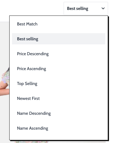
Dropdown
Section titled “Dropdown”A compact dropdown menu. The visitor clicks it, selects a sort order, and the dropdown closes.
[ Sort by: Price (low to high) v ]This is the most common style on desktop.
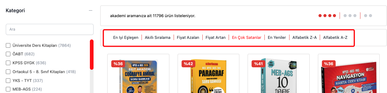
Buttons
Section titled “Buttons”A row of clickable buttons. Each button is a sort order. The active one is highlighted.
[ Smart ] [ Price ↑ ] [ Price ↓ ] [ Newest ]You can limit how many buttons are shown. If there are more sort orders than the limit, the extra ones are hidden.
Real-world example:
List Dropdown
Section titled “List Dropdown”Similar to a regular dropdown, but the options are displayed as a vertical list inside the dropdown. You can limit how many options are visible before the visitor needs to scroll.
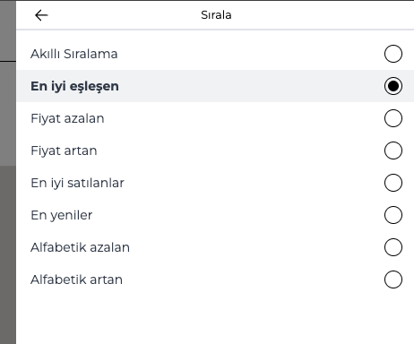
Modal (Mobile)
Section titled “Modal (Mobile)”On mobile, sorting can open as a full-screen popup. The visitor taps a sort option, then the popup closes and results update.
This is useful on small screens where a dropdown would be hard to tap.
Real-world example:
Apply Button for Sorting
Section titled “Apply Button for Sorting”By default, selecting a sort order applies immediately. But you can add an Apply button so the visitor first selects the sort order, then taps “Apply” to confirm.
Custom Sort Orders
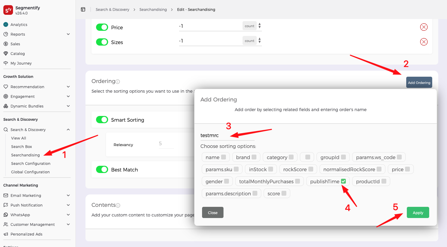
Section titled “Custom Sort Orders”Beyond the 8 built-in sort orders, you can add custom sort orders defined in the Segmentify dashboard.
Custom sort orders let the merchandising team create sorting rules tailored to business goals. For example:
- “Highest Margin” — products sorted by profit margin.
- “Trending Now” — products sorted by recent click or view velocity.
- “Promoted” — products manually boosted by the merchandising team for a campaign.
- “Seasonal Picks” — a curated order for a holiday or seasonal push.
The merchandising team creates these custom sorting rules in the Segmentify dashboard. Each custom rule gets a sort code (e.g., CUSTOM_SORT_1). You then add that code to the SDK’s orderTypes list, and the visitor sees it as another sort option alongside the built-in ones.
[ Smart Sorting v ] [ Best Match ] [ Trending Now ] [ Promoted ] ↑ custom ↑ customThe visitor does not see any difference between built-in and custom sort orders. They all appear in the same dropdown, button row, or modal.
Since custom sort codes do not have built-in translations, you need to provide a label through the dictionary. Otherwise, the visitor sees the raw code (e.g., “CUSTOM_SORT_1” instead of “Trending Now”).
dictionary: { languageCode: 'EN', EN: { CUSTOM_SORT_1: 'Trending Now', CUSTOM_SORT_2: 'Promoted', }, TR: { CUSTOM_SORT_1: 'Trend Olanlar', CUSTOM_SORT_2: 'Öne Çıkanlar', },}When the visitor selects a custom sort order, the SDK sends the sort code to the Segmentify backend, which applies the custom sorting logic and returns the reordered results.
You can see how custom sort order can be added in the following example:
Visual Sorting (Grid Toggle)
Section titled “Visual Sorting (Grid Toggle)”What the Visitor Sees
Section titled “What the Visitor Sees”Visual sorting lets the visitor change how many products appear in each row of the grid. It shows small icon buttons representing different grid layouts.
For example:
[ ▪▪ ] [ ▪▪▪ ] [ ▪▪▪▪ ] 2 3 4- Clicking the first icon shows 2 products per row (larger cards).
- Clicking the second shows 3 per row (medium cards).
- Clicking the third shows 4 per row (smaller cards).
What You Can Control
Section titled “What You Can Control”- Which grid sizes are available. For example,
[4, 3, 2]means the visitor can choose between 4, 3, or 2 columns. - The default grid size. Which layout is selected when the page first loads.
Pagination
Section titled “Pagination”What the Visitor Sees
Section titled “What the Visitor Sees”When there are too many products to show on one screen, pagination lets the visitor browse through pages of results.
Pagination Styles
Section titled “Pagination Styles”The SDK supports two pagination types and several options within them:
1. Numbered Pages (Default)
Section titled “1. Numbered Pages (Default)”Classic page numbers at the bottom of the results. The visitor clicks a number to go to that page.
+--------+  +--------+  +--------+|Product |  |Product |  |Product |+--------+  +--------+  +--------+
  [ < Prev ]  1  2  [3]  4  5  [ Next > ]
This also includes “First”, “Last”, “Previous”, and “Next” buttons. You can optionally scroll to the top when the visitor changes pages.
2. Infinite Scroll
Section titled “2. Infinite Scroll”Products load continuously as the visitor scrolls down. There are no page numbers. When the visitor reaches the bottom, the next batch of products appears automatically.
+--------+ +--------+ +--------+|Product | |Product | |Product |+--------+ +--------+ +--------++--------+ +--------+ +--------+|Product | |Product | |Product |+--------+ +--------+ +--------+ ↓ scrolling ↓+--------+ +--------+ +--------+|Product | |Product | |Product | ← loaded automatically+--------+ +--------+ +--------+Within the infinite scroll type, you can also add:
- A “Load More” button — instead of loading automatically on scroll, the visitor clicks a button to load the next batch.
- A “See All” button — a link that loads all remaining products at once. Use this with caution if there are many results.
These options can be combined. For example, you can show a “See All” button that, once clicked, switches to automatic infinite scrolling.
Disabling Pagination
Section titled “Disabling Pagination”You can also turn off pagination entirely. In this case, all products that fit the first response are shown and there is no way to see more. This is usually only used in the Searchbox popup where you want a limited preview.
Summary
Section titled “Summary”| Feature | What it means |
|---|---|
| 8 built-in sort orders | Smart Sorting, Best Match, Price (both directions), Best Sellers, Newest, Name (both directions). |
| Custom sort orders | Add sorting rules defined in the Segmentify dashboard alongside the built-in ones. |
| 4 display styles | Dropdown, buttons, list dropdown, or mobile modal. |
| Choose which to show | You pick which sort orders to offer to visitors. |
| Apply button | Optionally require the visitor to confirm their sort choice. |
| Grid toggle | Let visitors switch between 2, 3, or 4 products per row. |
| Numbered pages | Classic page numbers with prev/next navigation. |
| Infinite scroll | Products load automatically as the visitor scrolls down. |
| Load more | A button that adds more products below the current ones (within infinite scroll). |
| See All | A link that loads all remaining products at once (within infinite scroll). |
Configuration Reference (for developers)
Section titled “Configuration Reference (for developers)”Sorting, visual sorting, and pagination are each configured through their own building blocks in the layout tree.
Sorting
Section titled “Sorting”{ component: 'sorting', componentOptions: { orderTypes: [ // Which sort orders to offer 'SMART_SORTING', 'BEST_MATCH', 'PRICE_DESC', 'PRICE_ASC', 'BEST_SELLERS', 'NEWEST', 'ALPHABETICAL_DESC', 'ALPHABETICAL_ASC', 'CUSTOM_SORT_1', // Custom sort order from the dashboard 'CUSTOM_SORT_2', // Another custom sort order ], isDropdown: true, // Show as a dropdown isModal: false, // Show in a modal (common on mobile) isListDropdown: false, // Show as a list-style dropdown isApplyButtonEnabled: false, // Show "Apply" button inside sorting panel buttonLimit: null, // Max sort buttons to show (null = no limit) listLimit: 3, // Max items visible before scrolling in list dropdown customIcon: false, // Custom dropdown icon },}Custom sort codes (e.g., CUSTOM_SORT_1) must match the codes defined in the Segmentify dashboard. Provide visitor-facing labels for each custom code through the dictionary config (see Languages and Translations).
Real-world example:
Visual sorting
Section titled “Visual sorting”{ component: 'visualSorting', componentOptions: { visualOrders: [4, 3, 2], // Grid column counts the visitor can toggle between defaultOrder: null, // Default column count (must be in visualOrders) },}Pagination
Section titled “Pagination”Pagination is configured inside the productList building block:
{ component: 'productList', componentOptions: { pagination: { type: 'default', // 'default' (numbered pages) or 'infinite' (continuous scroll) disabled: false, // Disable pagination entirely scrollTop: true, // Scroll to top on page change (only for 'default') isLoadMore: false, // Show "Load More" button (only for 'infinite') isSeeAll: false, // Show "See All" button (only for 'infinite') }, },}