Searchbox (System 2)
The popup that appears when a visitor clicks on or types into the search bar.
This page explains the popup that appears when a visitor clicks on or types into the search bar.
What Is the Searchbox?
Section titled “What Is the Searchbox?”The Searchbox is the popup overlay that appears when a visitor interacts with the search bar. Think of it like an assistant that immediately starts helping the visitor before they even finish typing.
It shows helpful content like recent searches, popular keywords, trending products, and live search results. All in a popup that floats over the page.
Two States: Before and After Typing
Section titled “Two States: Before and After Typing”The Searchbox has two different states depending on whether the visitor has started typing or not.
Before Typing (Before Search)
Section titled “Before Typing (Before Search)”This is what the visitor sees when they first click on the search bar but haven’t typed anything yet (or typed too few characters, this can be configured via the dashboard). You can show any combination of the following:
| Content | Description |
|---|---|
| Recent searches | The visitor’s own past searches (e.g., “red shoes”, “winter jacket”). They can click one to search again. |
| Popular keywords | Trending search terms across all visitors (e.g., “bestseller”, “new arrivals”). Can be displayed as a horizontal slider. |
| Top categories | The most popular product categories (e.g., “Electronics”, “Clothing”). |
| Top brands | The most popular brands (e.g., “Nike”, “Samsung”). |
| Brand logos | Brand logos displayed as a visual list. It is usually located in the bottom right corner. |
| Banners | Promotional images at the top or bottom of the popup (e.g., a “Free shipping” banner). |
| Product preview | A small grid of popular or recommended products. |
Real world example of the searchbox in “before search” state with popular searches, popular categories and popular brands:
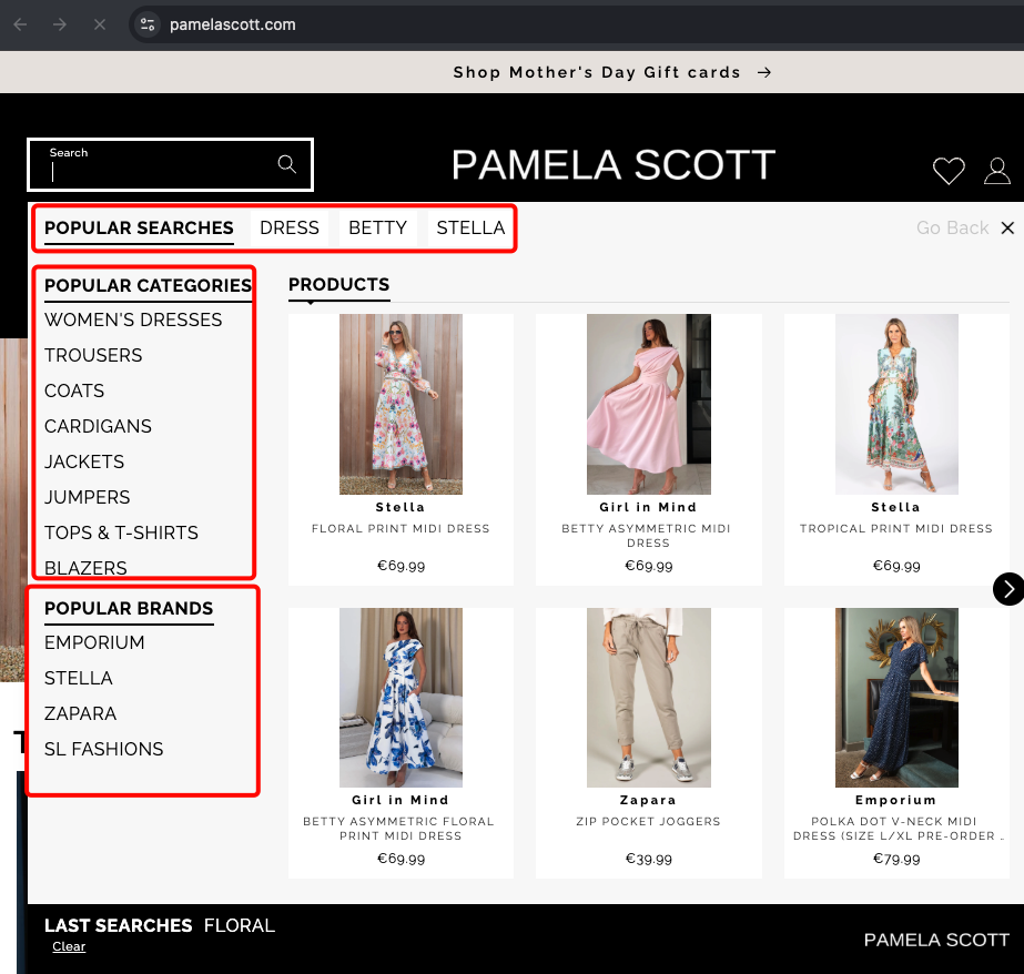
We will explain each of these content blocks in more detail in the next sections. But for now just know that we call these small “popular” parts as ASSETS.
After Typing (After Search)
Section titled “After Typing (After Search)”This is what the visitor sees once they have typed enough characters and results come back. You can show any combination of the following:
| Content | Description |
|---|---|
| Live product results | A product grid showing items that match the search query. |
| Related categories | The visitor can narrow results by related categories, right inside the popup. |
| Related brands | The visitor can narrow results by related brands, right inside the popup. |
| Banners | Promotional banners above or below the results. |
| ”See All” button | A button that takes the visitor to the full search results page. |
Real world example of the searchbox in “after search” state with live product results:
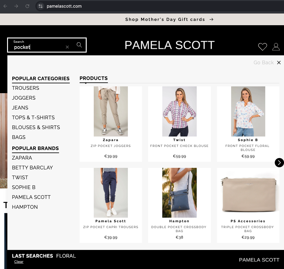
The main difference between the “before search” and “after search” states is that the “before search” renders the “popular brands” but doesn’t.
What the Popup Looks Like
Section titled “What the Popup Looks Like”The popup appearance can be customized:
| Content | Description |
|---|---|
| Overlay | You can show a dark overlay behind the popup so the rest of the page fades out. This focuses the visitor’s attention on the search results. |
| Width | You can control how wide the popup is. Full width means it stretches across the entire screen. |
| Back to top | On mobile, you can add a “back to top” button so visitors can scroll back up easily. |
| Close button | A button to dismiss the popup and go back to browsing. |
| Search input inside the popup | On mobile, the popup often includes its own search input at the top so visitors can keep typing after the popup opens. |
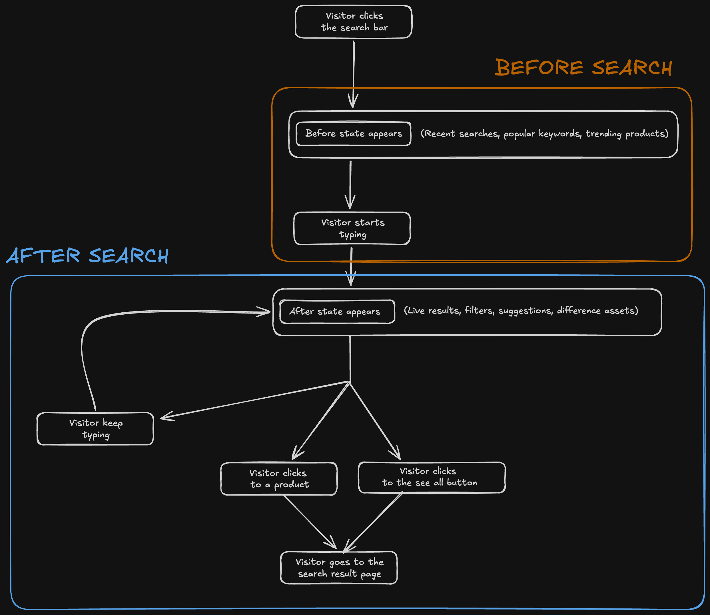
Summary as a diagram
Section titled “Summary as a diagram”Here is what a typical visitor experience looks like as a diagram:
What Content Can Appear in Each State
Section titled “What Content Can Appear in Each State”| Content | Before Typing | After Typing |
|---|---|---|
| Recent searches | Yes | — |
| Popular keywords | Yes | — |
| Top categories | Yes | — |
| Top brands | Yes | — |
| Brand logos | Yes | Yes |
| Product preview | Yes | Yes |
| Related categories | — | Yes |
| Related brands | — | Yes |
| Banners | Yes | Yes |
Advanced: Searchandising Inside the Popup
Section titled “Advanced: Searchandising Inside the Popup”For the “after” state, you can choose to show a full search results experience inside the popup itself. This means the popup behaves almost like a mini results page, with filters, sorting, and pagination. Without the visitor ever leaving the current page.
This is useful for websites that want to give visitors a complete search experience without navigating away. Let me give you two examples:
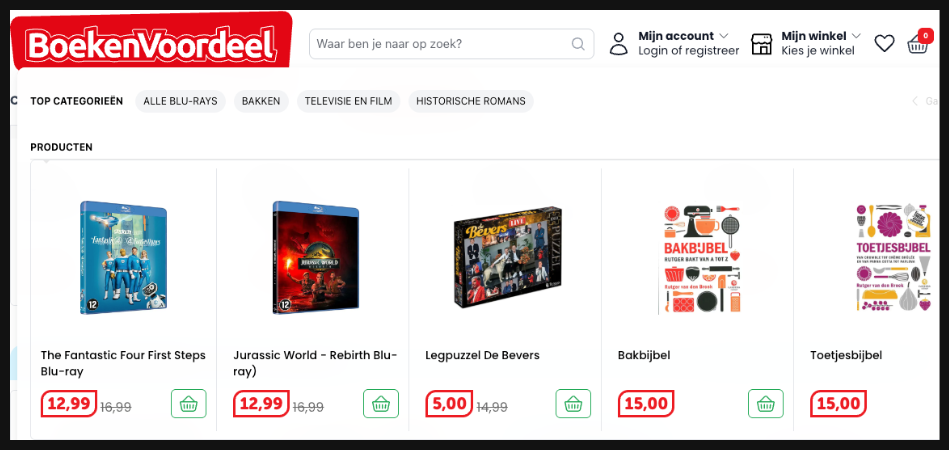
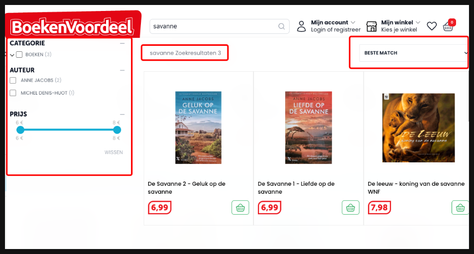
First happens in https://www.boekenvoordeel.nl/.
When you don’t write anything it still acts like a before search:
But when you start typing, it shows you live product results with filters that can be applied directly in the popup:
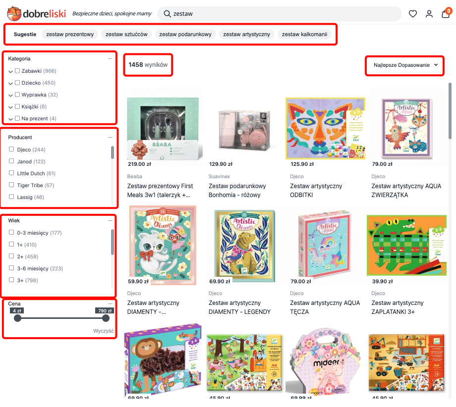
The same thing happens in https://www.dobrelski.nl/ too:
Summary
Section titled “Summary”| Capability | What it means |
|---|---|
| Before state | Show helpful content (recent searches, popular keywords, trending products) before the visitor types. |
| After state | Show live search results, suggestions, and filters once the visitor starts typing. |
| Full-screen on mobile | The popup takes over the entire screen on phones for a better experience. |
| Dropdown on desktop | The popup appears as a dropdown below the search bar on computers. |
| Overlay | Optionally dim the rest of the page behind the popup. |
| Filters in the popup | Visitors can filter results without going to the full results page. |
| See All button | A link to the full results page for visitors who want more. |
| Banners | Promotional images at the top or bottom of the popup. |
| Mini results page | Optionally show a full search experience (with filters and sorting) inside the popup. |
Configuration Reference (for developers)
Section titled “Configuration Reference (for developers)”The Searchbox is configured through the searchBox key in the main config object passed to SegmentifySearch.run(). It has separate mobile and desktop sub-keys, each with the same shape:
SegmentifySearch.run({ searchBox: { mobile: { popupConfig: { /* ... */ }, before: { /* ... */ }, after: { /* ... */ }, }, desktop: { popupConfig: { /* ... */ }, before: { /* ... */ }, after: { /* ... */ }, }, }, // ... other config keys});popupConfig — the popup wrapper
Section titled “popupConfig — the popup wrapper”Controls how the popup container itself looks and behaves.
popupConfig: { designName: 'default', // Visual design variant width: 12, // Popup width on 12-column grid (12 = full width) overlay: true, // Required. Show dark overlay behind the popup backToTop: true, // Show a "back to top" button (useful on mobile) layout: { // Optional layout tree for the popup wrapper (e.g. closeButton, searchInput) component: 'main', children: [ /* ... */ ], },}before — the “before typing” state
Section titled “before — the “before typing” state”Defines what visitors see when they click the search bar but haven’t typed anything yet (or typed fewer characters than the configured minimum).
before: { layout: { // Full layout tree of building blocks component: 'main', children: [ /* ... */ ], },}The building blocks you can place inside the before layout:
| Component | What it does | Key options (componentOptions) |
|---|---|---|
assetList | Renders a list of popular/recent items. | assetType — 'lastSearches', 'keywords', 'categories', or 'brands'. action — 'hover' or 'click'. hasSlider (boolean) — enable horizontal slider. header.viewMode — 'horizontal' or 'vertical'. |
productListSearchbox | A product grid showing popular or recommended products. | sorting.type — 'grid' or 'slider'. sorting.config — responsive breakpoint settings. loading — skeleton loader settings. noResult — no-result design. |
banners | Promotional images at configurable positions. | position — 'RESULTS_HEADER', 'RESULTS_FOOTER', 'ASSETS_HEADER', or 'ASSETS_FOOTER'. |
logo | Displays a logo image inside the popup. | logoSrc (string) — URL of the logo image. |
brandLogoList | Displays brand logos as a visual list. | Similar to assetList with brand-specific options. |
after — the “after typing” state
Section titled “after — the “after typing” state”Defines what visitors see once they have typed enough characters and results come back.
after: { campaignType: 'searchandising', // Set to 'searchandising' for full faceted search inside the popup layout: { // Full layout tree of building blocks component: 'main', children: [ /* ... */ ], },}The building blocks you can place inside the after layout:
| Component | What it does | Key options (componentOptions) |
|---|---|---|
suggestions | Alternative search terms related to the visitor’s query. | minProductCount (number) — minimum products for a suggestion to show. blackList (array) — terms to exclude. header.title (string) — section title. |
facet | Filter panel for narrowing results by category, brand, price, etc. | type — 'sidebar', 'topList', 'modal', or 'dropdown'. searchLimit (number) — min items to show search inside facet. facets — facet configuration. isSticky (boolean). |
selectedFacet | Tags showing currently active filters with remove buttons. | withoutApplyButton (boolean) — hide the apply button. |
sorting | Controls for reordering results (by price, popularity, etc.). | isDropdown (boolean). isModal (boolean). buttonLimit (number or null). orderTypes — array of available sort options. |
stat | Displays the result count (e.g. “42 products found”). | No required options. |
productList | The main product results grid with pagination support. | pagination.type — 'default' or 'infinite'. pagination.scrollTop (boolean). pagination.isSeeAll (boolean). pagination.isLoadMore (boolean). loading and noResult — design settings. |
productListSearchbox | A lighter product grid (used when not in searchandising mode). | Same options as the before state version. |
banners | Promotional images at configurable positions. | position — 'RESULTS_HEADER' or 'RESULTS_FOOTER'. |
Shared layout properties
Section titled “Shared layout properties”Every component in the layout tree also accepts these shared properties:
{ component: 'assetList', // Required. The component type width: 12, // 1-12 column grid designName: 'default', // Visual design variant viewMode: 'horizontal', // 'horizontal' or 'vertical' justifyContent: 'between', // 'start', 'end', 'center', 'between', 'around', 'evenly', 'stretch' gap: 2, // 0-10 spacing between children (each unit = 0.25rem) styleId: 'my-custom-id', // Custom CSS id for targeting children: [ /* ... */ ], // Nested components (separator is the generic container)}Full example
Section titled “Full example”SegmentifySearch.run({ searchBox: { desktop: { popupConfig: { designName: 'default', width: 12, overlay: false, backToTop: false, }, before: { layout: { component: 'main', viewMode: 'vertical', children: [ { component: 'separator', width: 12, viewMode: 'horizontal', children: [ { component: 'assetList', width: 10, componentOptions: { assetType: 'lastSearches', action: 'hover', viewMode: 'horizontal', header: { viewMode: 'horizontal' }, }, }, ], }, { component: 'separator', width: 12, viewMode: 'horizontal', children: [ { component: 'assetList', width: 12, componentOptions: { assetType: 'keywords', action: 'hover', viewMode: 'horizontal', header: { viewMode: 'horizontal' }, }, }, ], }, { component: 'separator', width: 12, viewMode: 'horizontal', justifyContent: 'between', children: [ { component: 'separator', viewMode: 'vertical', width: 3, gap: 2, children: [ { component: 'assetList', width: 12, componentOptions: { assetType: 'categories', action: 'hover', header: { viewMode: 'vertical' }, }, }, { component: 'assetList', width: 12, componentOptions: { assetType: 'brands', action: 'hover', header: { viewMode: 'vertical' }, }, }, ], }, { component: 'separator', viewMode: 'vertical', width: 9, children: [ { component: 'banners', width: 12, componentOptions: { position: 'RESULTS_HEADER' }, }, { component: 'productListSearchbox', width: 12, designName: 'default', componentOptions: { sorting: { type: 'slider', config: { spaceBetween: 20, breakpoints: { 0: { slidesPerView: 2, slidesPerGroup: 2 }, 960: { slidesPerView: 4, slidesPerGroup: 4 }, }, grid: { rows: 2, fill: 'row' }, }, }, loading: { designName: 'default', skeletonCount: 3, skeletonRow: 2, }, noResult: { designName: 'default' }, }, }, { component: 'banners', width: 12, componentOptions: { position: 'RESULTS_FOOTER' }, }, ], }, ], }, ], }, }, after: { campaignType: 'searchandising', layout: { component: 'main', viewMode: 'vertical', target: '#segmentify-search', gap: 5, children: [ { component: 'suggestions', width: 12, componentOptions: { minProductCount: 2, header: { designName: 'default', title: 'Suggestions', viewMode: 'horizontal', }, }, }, { component: 'separator', viewMode: 'horizontal', width: 12, justifyContent: 'between', gap: 2, children: [ { component: 'separator', viewMode: 'vertical', width: 3, children: [ { component: 'facet', width: 12, type: 'sidebar', componentOptions: { searchLimit: 20, isSticky: true, applyButton: { enabled: false }, facetHeader: { enabled: true, defaultOpen: true }, }, }, ], }, { component: 'separator', viewMode: 'vertical', width: 9, children: [ { component: 'separator', viewMode: 'horizontal', width: 12, justifyContent: 'between', gap: 2, children: [ { component: 'stat', width: 8 }, { component: 'sorting', width: 4, componentOptions: { isDropdown: true, orderTypes: [ 'BEST_MATCH', 'PRICE_ASC', 'PRICE_DESC', ], }, }, ], }, { component: 'selectedFacet', width: 12 }, { component: 'productList', width: 12, componentOptions: { pagination: { type: 'infinite', isSeeAll: false, isLoadMore: false, }, }, }, ], }, ], }, ], }, }, }, mobile: { popupConfig: { designName: 'default', width: 12, overlay: true, backToTop: true, layout: { component: 'main', width: 12, viewMode: 'vertical', children: [ { component: 'closeButton', designName: 'default', width: 2 }, { component: 'searchInput', designName: 'default', width: 10, componentOptions: { placeholder: 'Search', clearIcon: true }, }, ], }, }, before: { layout: { component: 'main', viewMode: 'vertical', gap: 4, children: [ { component: 'separator', viewMode: 'vertical', width: 12, gap: 2, children: [ { component: 'assetList', width: 12, componentOptions: { assetType: 'lastSearches', action: 'hover', viewMode: 'horizontal', header: { viewMode: 'horizontal' }, }, }, { component: 'assetList', width: 12, componentOptions: { assetType: 'keywords', action: 'hover', hasSlider: true, header: { viewMode: 'vertical' }, }, }, ], }, { component: 'separator', viewMode: 'vertical', width: 12, children: [ { component: 'banners', width: 12, componentOptions: { position: 'RESULTS_HEADER' }, }, { component: 'productListSearchbox', width: 12, designName: 'default', componentOptions: { sorting: { type: 'grid', config: { 0: { items: 2 }, 768: { items: 3 }, 1280: { items: 4 }, }, }, loading: { designName: 'default', skeletonCount: 3, skeletonRow: 2, }, noResult: { designName: 'default' }, headerConfig: { designName: 'default', seeAll: true }, }, }, { component: 'banners', width: 12, componentOptions: { position: 'RESULTS_FOOTER' }, }, ], }, ], }, }, after: { campaignType: 'searchandising', layout: { component: 'main', viewMode: 'vertical', target: '#segmentify-search', children: [ { component: 'suggestions', width: 12, componentOptions: { minProductCount: 2, header: { designName: 'default', title: 'Suggestions', viewMode: 'vertical', }, }, }, { component: 'facet', width: 12, type: 'modal', componentOptions: { searchLimit: 20, isSticky: true, applyButton: { enabled: true, text: 'apply', position: 'end' }, facetHeader: { enabled: true, defaultOpen: true }, }, }, { component: 'separator', width: 12, viewMode: 'horizontal', gap: 2, children: [ { component: 'stat', width: 6 }, { component: 'sorting', width: 6, componentOptions: { isDropdown: true, orderTypes: ['BEST_MATCH', 'PRICE_ASC', 'PRICE_DESC'], }, }, ], }, { component: 'selectedFacet', width: 12, withoutApplyButton: true }, { component: 'productList', width: 12, componentOptions: { pagination: { type: 'infinite', isSeeAll: false, isLoadMore: false, }, }, }, ], }, }, }, }, // ...searchInput, searchandising, breakpoint, etc.});